
The Importance of Responsive and Mobile-First Web Design
“`html
Mobile-First Responsive Web Design & SEO: What CMOs Need to Get Right in 2026
Here’s a number that should stop you mid-scroll: over 60% of all web traffic now comes from mobile devices. Yet a surprising number of B2B websites still treat mobile as an afterthought — a scaled-down version of the “real” desktop site. That gap between behavior and design is costing you rankings, leads, and revenue. Mobile-first responsive web design SEO isn’t a UX checkbox anymore. It’s a core business strategy, and Google has been telling us so for years.
If you’re a CMO or founder trying to build topical authority and sustainable organic growth, this is where the conversation has to start. Not with content calendars. Not with backlinks. With the foundation: how your site behaves the moment a prospect lands on it from their phone.
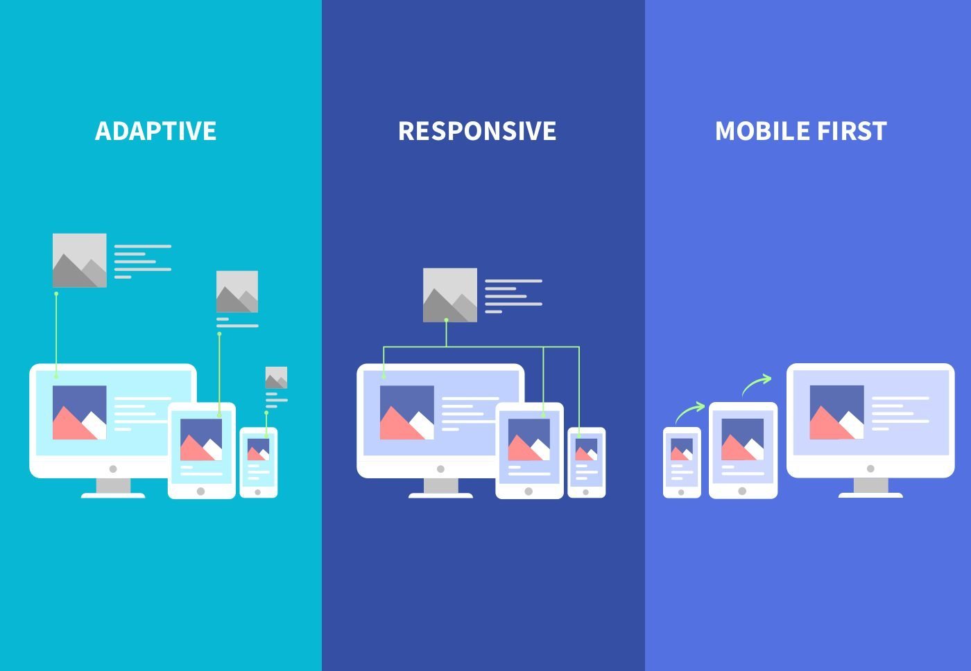
What “Mobile-First” Actually Means (and What Most Teams Get Wrong)
Mobile-first design means you build and optimize your website for the smallest screen first, then progressively enhance the experience for tablets and desktops. That’s the opposite of what most legacy sites did — cramming a desktop layout into a smaller viewport and calling it responsive.
The distinction matters because Google’s mobile-first indexing — fully rolled out and non-negotiable as of 2024 — means the Googlebot crawls and evaluates the mobile version of your site to determine rankings. If your mobile experience is thin, slow, or structurally broken, your desktop site’s polish is irrelevant to the algorithm.
Claro: you can have a beautiful desktop site and still be invisible in search if the mobile version underperforms. That’s not a technicality — that’s the ranking reality.
Why Mobile-First Responsive Web Design Directly Impacts SEO
The relationship between mobile design and SEO is tighter than most marketing teams realize. It’s not just about passing Google’s mobile usability test. The signals stack:
- Page speed: Google’s Core Web Vitals — Largest Contentful Paint (LCP), Interaction to Next Paint (INP), and Cumulative Layout Shift (CLS) — are measured on mobile. Slow load times on phones translate directly into ranking penalties and higher bounce rates.
- Crawl parity: If content visible on desktop is hidden or absent on mobile (buried behind accordions that don’t render for bots, or blocked by lazy-load scripts), Google may not index it. That content doesn’t contribute to your topical authority.
- Structured data consistency: Your schema markup needs to be present and consistent across both mobile and desktop versions. Discrepancies confuse the crawler and dilute entity signals that power semantic SEO.
- User behavior signals: Dwell time, scroll depth, and engagement rates from mobile users feed into Google’s quality assessments. A friction-heavy mobile experience tanks these metrics fast.
This is why understanding SEO fundamentals matters before you invest in content. The technical and structural layer — including mobile-first architecture — determines whether your content can even compete.
Mobile UX and Topical Authority: The Connection Teams Miss
Here’s a perspective most agencies won’t give you: mobile-first design is a topical authority issue, not just a technical one.
If your site structure is messy on mobile — key pillar pages buried three taps deep, internal links broken by responsive layout failures, supporting content unreachable from a phone — Google can’t efficiently map the semantic relationships between your pages. The crawler struggles to understand what your site is actually authoritative about.
Sin chamullo: you can produce excellent content and still fail to build topical authority if the mobile architecture prevents Google from connecting the dots between your pillar pages and supporting clusters. Mobile-first responsive web design and semantic SEO are interdependent, not parallel tracks.
In 2026, with AI-driven search results (Google’s AI Overviews, SGE refinements) drawing from sites that demonstrate clear expertise and consistent content structure, that connectivity matters more than ever. Sites that are technically sound on mobile and semantically organized are the ones getting cited in AI-generated answers.
Best Practices for Mobile-First Responsive Web Design in 2026
Start With the Smallest Viewport
Design for a 375px wide screen first. Every content decision — hierarchy, navigation, CTAs, imagery — gets made for that constraint. Then scale up. This forces clarity: if an element doesn’t earn its place on mobile, it probably doesn’t belong anywhere.
Prioritize Core Web Vitals Aggressively
Target an LCP under 2.5 seconds on mobile. Compress and serve next-gen image formats (WebP, AVIF). Minimize render-blocking JavaScript. Use browser caching and a CDN. These aren’t optional optimizations — they’re ranking factors with documented Google documentation backing them.
Build Touch-Friendly Navigation
Buttons and tap targets should be a minimum of 44×44 pixels. Navigation menus need to be concise — a well-implemented hamburger menu is fine, but the critical pages (your pillar pages, service pages, contact) must be reachable in two taps or fewer. Every extra tap is friction that increases bounce probability.
Maintain Content Parity Between Mobile and Desktop
Every piece of content that supports your SEO strategy — headers, body copy, internal links, schema markup — must be present and crawlable on mobile. Audit this regularly. Responsive frameworks can hide content in ways that look fine visually but break indexation.
Test With Real Devices, Not Just Emulators
Browser emulators catch obvious problems. Real devices catch everything else — font rendering issues, tap delay, scroll jank, layout shifts on specific OS versions. In 2026, with device fragmentation wider than ever, emulator-only QA is a liability.
What This Means for B2B Companies Specifically
B2B buyers — even enterprise decision-makers — are researching on their phones. LinkedIn scrolls. Google searches during commutes. Quick vendor comparisons between meetings. The myth that B2B audiences are exclusively desktop users was always fragile, and the data has long since buried it.
For CMOs and founders building content marketing programs, the implication is direct: if your site’s mobile experience creates friction at the research stage, you’re losing consideration before you ever get a conversation. The brand trust signals that mobile UX generates — fast load, clean layout, easy navigation — are part of the buying decision, even if the final conversion happens on desktop.
A well-executed mobile-first responsive design also strengthens your EEAT signals (Experience, Expertise, Authoritativeness, Trustworthiness). A site that performs flawlessly across devices signals investment and professionalism. A broken mobile experience signals the opposite, regardless of how strong your content is.
The 2026 Baseline: What Google and Users Now Expect
The bar has moved. In 2026, passing Google’s mobile usability test is table stakes — the minimum required to be in the game. What separates competitive sites now is:
- Sub-2-second mobile load times on real 4G connections
- Zero layout shift during page load (CLS score below 0.1)
- Consistent schema and structured data across mobile and desktop
- Clear content hierarchy that translates from desktop to mobile without losing semantic structure
- Internal linking that works and is visible to Googlebot on the mobile-rendered page
These aren’t aspirational targets. They’re the baseline for any B2B site trying to rank for competitive terms and build durable topical authority in search.
Build the Foundation First, Then the Content
Mobile-first responsive web design and SEO aren’t separate conversations. They’re the same conversation about whether your site can earn and hold visibility in search — and whether the people who find you stay long enough to trust you.
If you’re investing in content marketing, semantic SEO, or topical authority frameworks without auditing your mobile foundation first, you’re building on sand. The content strategy has nowhere solid to land.
Ready to audit where your mobile-first SEO foundation actually stands? At Social Peak Media, we work with CMOs and founders to close the gap between content strategy and technical execution — starting with the signals that matter most to search in 2026. Let’s talk about what your site needs.
By Jose Villalobos — Social Peak Media
“`