
Improving On-Page SEO to Enhance User Experience
“`html
On-Page SEO User Experience Optimization: What Actually Moves Rankings in 2026
Most SEO checklists are written for crawlers, not humans. They tell you to add keywords to your H1, compress your images, write a meta description—and stop there. But Google’s ranking systems have moved far beyond that. In 2026, on-page SEO user experience optimization is the real game: the practice of building pages that satisfy search intent so completely that users don’t need to go back to the results page. That behavior—called “dwell signal” by some researchers—is one of the clearest quality indicators search engines have. If your pages aren’t earning it, no amount of keyword stuffing will save your rankings.
This guide breaks down the on-page factors that directly shape user experience and, by extension, organic performance. We’ll cover mobile architecture, navigation logic, internal linking strategy, page speed, and content structure—all through the lens of what your buyer actually needs when they land on your page.
Why UX and On-Page SEO Are the Same Conversation Now
There was a time when you could game rankings by optimizing for the algorithm and ignoring the person. That window closed. Google’s Helpful Content system, rolled out in waves since 2022 and deeply embedded in core updates through 2025, demotes content that exists primarily for search engines. The signal it’s looking for: did the user get what they came for?
When visitors engage with your content—reading past the fold, clicking to a second page, sharing, returning—they send behavioral signals that reinforce your authority on a topic. When they bounce in three seconds, the opposite happens. Focusing on user experience isn’t a soft, brand-feel exercise. It’s a direct ranking input.
This is also why on-page SEO connects so tightly to our our seo fundamentals pillar“>SEO Fundamentals pillar—the technical foundation and the human experience have to work together. One without the other leaves rankings on the table.
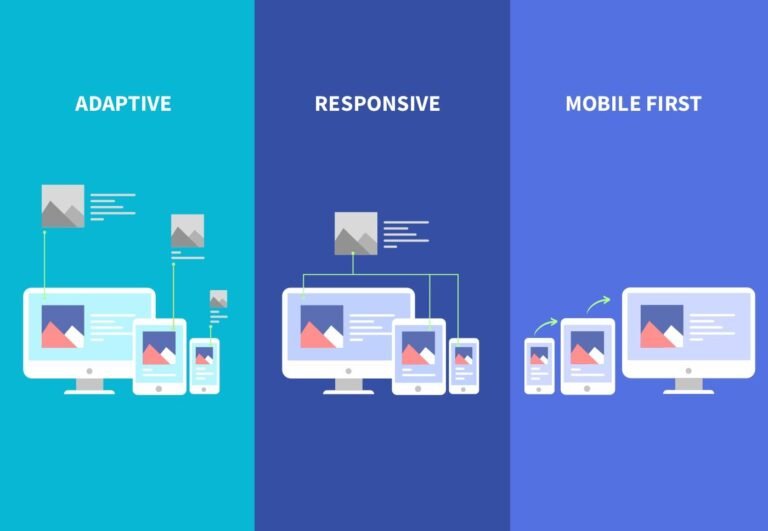
Mobile-First Is Table Stakes—But Most Sites Still Fail It
Google has indexed the mobile version of your site first since 2019. In 2026, there is no second-place version of your website. The mobile experience is the website. Yet a surprising number of B2B and local business sites still treat mobile as an afterthought—cramped navigation, oversized images, tap targets too small for a thumb, copy that requires horizontal scrolling.
A genuinely mobile-optimized page means:
- Responsive layout that reflows content cleanly at every breakpoint, not just at 375px and 1440px
- Tap targets at least 48px tall so users don’t miss buttons or links
- Font sizes above 16px on body copy so no one has to pinch-zoom
- No intrusive interstitials that block content on arrival—Google penalizes these directly
- Core Web Vitals passing on mobile, specifically LCP under 2.5 seconds and CLS under 0.1
For local businesses, this matters even more acutely. “Coffee shop near me,” “accountant in Austin,” “HVAC repair open now”—these are mobile searches with immediate commercial intent. If your page loads slowly or forces users to fight the layout, they close the tab and tap your competitor. The conversion you lost wasn’t a ranking problem. It was a UX problem that became a ranking problem over time.
What to Audit Right Now
Run your key landing pages through Google’s PageSpeed Insights and Chrome’s mobile emulation. Look specifically at Largest Contentful Paint, Cumulative Layout Shift, and Interaction to Next Paint (INP)—the metric Google made a Core Web Vital in 2024 to replace FID. If INP is above 200ms on mobile, users are experiencing lag on every interaction. That kills trust fast.
Site Navigation: The Architecture of Intent
Navigation isn’t just a usability feature. It’s an SEO signal. A logical, shallow site architecture tells search engines which pages are most important and how topics relate to each other. It tells users where they are and where they can go. Both of those things matter for rankings.
The old model—a flat menu with ten top-level items pointing to unrelated pages—doesn’t serve either audience well. The 2026 standard for on-page SEO user experience optimization is topic-clustered navigation: your site structure mirrors your content strategy, grouping related pages under clear parent categories that signal topical depth.
Practically, this means:
- No important page more than three clicks from the homepage
- Breadcrumb navigation on every interior page (Google renders these in search results)
- Category pages that function as genuine resource hubs, not just index lists
- A search function on any site with more than 50 pages
Buena navegación no es solo diseño bonito—es arquitectura de autoridad, sin chamullo.
Internal Linking as a UX and Authority Signal
Internal links do two jobs simultaneously. They pass PageRank between pages, reinforcing your topical authority cluster. And they give readers a clear next step, reducing exits and deepening engagement. Most sites underinvest in both functions.
The strategic approach: every piece of content should link to at least one pillar page and two or three related cluster articles. Anchor text should be descriptive and keyword-relevant—not “click here,” not bare URLs. And the links should feel editorially natural, placed where a curious reader would actually want to go deeper.
This is core to a Semantic SEO and Topical Authority Framework. Search engines use internal link patterns to map your expertise. If your content on mobile SEO links back to your foundational SEO guide, you’re reinforcing a coherent knowledge graph. If your pages exist as isolated islands, you’re leaving authority stranded.
One Rule That Changes Everything
Audit your ten highest-traffic pages. Count their outbound internal links. If any of them have fewer than three, you’re losing equity. Add contextual links to related content and watch both engagement time and crawl frequency improve. Claro.
Page Speed: The Experience Tax No One Talks About
Every second of load time costs you users. Research from Google consistently shows conversion rates drop 20% for every additional second of mobile load time. That’s not a ranking abstraction—that’s revenue. And because Google measures real-user experience through Chrome data (the CrUX dataset), slow pages accumulate poor field data that influences rankings over time, even if your lab scores look fine.
The highest-impact fixes for most sites in 2026:
- Switch to next-gen image formats (WebP or AVIF) and implement lazy loading for below-fold images
- Eliminate render-blocking resources—defer non-critical JavaScript, inline critical CSS
- Use a CDN to reduce time to first byte for geographically distributed audiences
- Audit third-party scripts—chat widgets, analytics tags, and ad pixels are often the biggest hidden drag
Speed isn’t a developer problem that marketers can ignore. It’s a direct on-page SEO user experience optimization lever that every CMO should have visibility into.
Content Structure: How You Format Is Part of the Signal
On-page SEO in 2026 isn’t just about what you say—it’s about how the page is structured so users can navigate your argument efficiently. Search intent has fractures: some users want a quick answer, others want depth. Your formatting should serve both.
That means:
- Clear H2s and H3s that function as a scannable outline, not just visual decoration
- Short paragraphs—four lines maximum before a break, especially on mobile
- Bulleted lists for parallel items rather than comma-separated sentences buried in prose
- Bolded key phrases that let a skimming reader extract the core idea without reading everything
- A clear answer in the first 100 words for any informational query—don’t make users scroll to find out if they’re in the right place
Google’s featured snippet selection, People Also Ask expansion, and passage ranking all favor well-structured content. A page that answers questions clearly, in digestible sections, is both more useful to the reader and more extractable for AI-powered search features that are increasingly part of how results get displayed.
EEAT in Practice: Proving You Know What You’re Talking About
Experience, Expertise, Authoritativeness, Trustworthiness—Google’s quality rater guidelines use these criteria to evaluate content quality, and they’ve become more operationally important with each core update since 2022. For on-page SEO, this means your pages need to demonstrate not just topical coverage but genuine first-hand knowledge.
Concrete ways to signal EEAT on individual pages:
- Author bylines with linked bios that show credentials and real professional context
- Original data, case examples, or client outcomes that no one else can replicate
- Clear publication and update dates—freshness signals trust for fast-moving topics
- External citations to authoritative sources where claims need backing
- Editorial stance—pages that take a clear perspective perform better than hedged, both-sides content that says nothing
At Social Peak Media, we’ve seen client pages jump from page three to position five within 60 days of adding structured author information, updating statistics to 2025-2026 sources, and adding one or two genuine case examples. The content didn’t change fundamentally. The trust signals did.
Putting It Together: A 2026 On-Page Audit Checklist
- Mobile experience: passes Core Web Vitals on mobile, no intrusive popups on load, all tap targets accessible
- Page speed: LCP under 2.5s, INP under 200ms in field data (CrUX), CLS under 0.1
- Navigation: every key page reachable in three clicks, breadcrumbs present, clear category structure
- Internal links: minimum three contextual internal links per page, descriptive anchor text, pillar page linked
- Content structure: clear H2/H3 hierarchy, short paragraphs, answer visible above fold
- EEAT signals: author byline, updated date, original insight or data, external citations where needed
- Search intent match: page format matches query type (informational, commercial, navigational)
On-page SEO user experience optimization isn’t a one-time project. It’s an operating standard. The sites that treat every page as a product—something that can be tested, improved, and measured against user behavior—are the ones that compound authority over time while their competitors keep wondering why rankings won’t hold.
Want to understand how these on-page signals fit into a broader topical authority strategy? Start with our our seo fundamentals pillar“>SEO Fundamentals guide—it covers the structural foundation that makes everything here work harder.
Ready to audit your on-page experience with a team that does this for a living? Talk to Social Peak Media—we’ll tell you exactly where your pages are leaving rankings and revenue on the table.
Written by Jose Villalobos, Content Strategist at Social Peak Media.
“`