
Podcast Cover Art: Why It Matters & How to Design It
“`html
Podcast Cover Art Design Branding: What CMOs Get Wrong (and How to Fix It)
You’ve invested in a content strategy, booked credible guests, and produced episodes worth listening to. Then you upload a cover image that looks like a stock photo with text slapped on top. That’s where the brand falls apart. Podcast cover art design branding isn’t a decoration decision — it’s a positioning decision. And in directories where a potential listener scrolls past hundreds of shows in under thirty seconds, your art either earns the click or disappears into the noise.
This guide breaks down why it matters, what the specs actually require, and how to design cover art that works as a brand asset — not just a platform requirement.
Why Podcast Cover Art Is a Brand Problem, Not a Design Problem
Most founders and CMOs treat cover art like a checkbox. Get something that looks okay, meets the pixel requirements, move on. The problem is that “okay” doesn’t convert browsers into subscribers — and in podcast directories, you’re competing for attention alongside shows with full creative teams behind their visual identity.
A 2025 Buzzsprout survey found that 62% of listeners are more likely to try a new podcast if they find the cover art appealing. That’s not a design stat — that’s a top-of-funnel conversion stat. Your cover art is doing the same job your ad creative does, except it runs indefinitely at zero cost per impression.
Think about it from the CMO’s perspective: you’re spending on content production, distribution, maybe paid promotion. The one permanent asset visible to every potential listener across every platform is a 3000×3000 pixel image you probably rushed through in Canva.
Claro — the cover art is a small thing. But small things compound when your content strategy depends on organic reach instead of paid ads. If your show is part of a broader content marketing system built to replace paid ads with organic channels, every touchpoint needs to carry brand weight. The cover art is one of them.
What Platform Specs Actually Require (No Guesswork)
Before you design anything, meet the technical floor. Apple Podcasts and Spotify — the two directories that drive the majority of podcast discovery — share baseline requirements. Uploading an image that fails these specs means rejection or degraded display quality.
- Minimum size: 1400 x 1400 pixels
- Maximum size: 3000 x 3000 pixels
- Resolution: 72 DPI
- File format: JPG or PNG
- Color space: RGB (not CMYK — that’s print)
Design at 3000×3000 from the start. Scaling down is always cleaner than scaling up, and you’ll want the high-res version if you ever repurpose the art for merchandise, event banners, or social headers. Future-proofing the file costs nothing.
The Five Brand Elements That Make Cover Art Work
Podcast cover art design branding isn’t about making something beautiful in isolation. It’s about making something that communicates your show’s identity accurately and fast — thumbnail-sized, on a screen, to someone who’s never heard of you. Here’s what that actually requires.
1. Brand Consistency Across Every Channel
Your podcast cover should feel like it belongs to the same brand family as your website, LinkedIn presence, and email newsletter. Same typeface system. Same primary colors. Same visual tone. When a listener discovers your show on Spotify and then visits your site, there should be zero disconnect — that continuity is what builds recognition over time.
For B2B brands especially, inconsistency reads as disorganization. A CMO presenting a polished company website alongside a podcast cover that looks like it was designed by a different team sends the wrong signal about operational rigor.
2. Legible Title Text at Thumbnail Scale
This is where most designs fail silently. A show name that reads clearly on a 1400px canvas can become completely unreadable when the directory renders it at 55px. Test your design at small sizes before you finalize it. Open the file on your phone, shrink the window, squint. If you can’t read the title instantly, neither can the person scrolling Apple Podcasts on their commute.
Stick to one or two typefaces maximum. Bold weight for the show name. No decorative scripts unless your brand is explicitly artisan or lifestyle-oriented. Sans-serifs hold up better at small sizes — that’s not a preference, it’s readability physics.
3. Minimal Visual Complexity
The strongest podcast covers in competitive categories share one trait: they don’t try to say everything. One strong visual concept, a clear show name, and maybe a tagline if the space allows without crowding. That’s it.
Every additional element you add competes for attention. A busy design doesn’t look thorough — it looks amateur. Sin chamullo: restraint is the actual skill here, not adding more.
4. High Color Contrast
Contrast isn’t just an accessibility consideration — it’s a visibility mechanism. Dark directories, OLED screens, low-brightness settings: your cover needs to hold up across all of them. A low-contrast design that looks fine on your designer’s calibrated monitor can disappear entirely in real-world display conditions.
Use a contrast checker before locking your color palette. The goal is text-to-background contrast that passes WCAG AA standards at minimum. This also happens to make your cover more inclusive for listeners with visual impairments — a brand value worth demonstrating.
5. A Visual That Communicates Show Tone Instantly
Abstract art, generic microphones, and floating headphones are the visual equivalent of saying “we do solutions.” They communicate nothing specific. Your cover should give a first-time viewer a clear signal about what kind of show this is — the industry, the energy, the level of formality — before they read a single word.
For B2B shows: think about the emotional register your best episodes hit. Are you analytical and data-driven? The design should feel structured, precise, maybe monochromatic. Is your show conversational and founder-to-founder? Warmer colors, a real human face, something that signals approachability. The visual needs to match the audio experience or the new listener will feel misled after the first ten minutes.
A Note on Host Photos in Cover Art
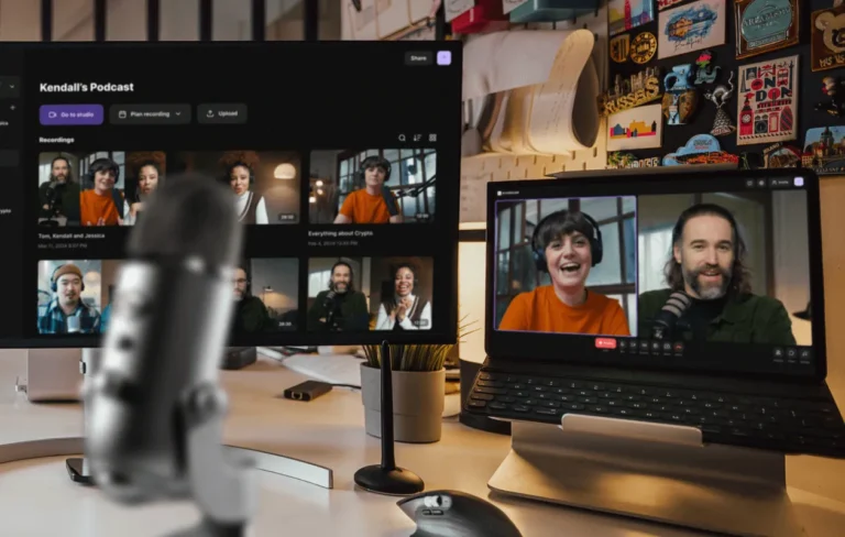
Whether to include the host’s face is a genuine strategic question, not just a design preference. Shows built around a personal brand — a named founder, a recognized industry voice — often perform better with a face on the cover. It signals authority and creates a parasocial entry point.
Company or brand-led shows typically do better with a concept-driven visual that puts the topic or niche front and center. The show name carries the brand, not an individual. By 2026, as more B2B companies build podcast libraries as content assets rather than personality platforms, this distinction matters more. Your cover art should reflect your distribution model, not just your aesthetic preference.
How Cover Art Fits Into a Larger Organic Content System
Here’s what most podcast launch checklists miss: cover art design branding isn’t a one-time task. It’s an ongoing brand signal that either reinforces or undermines every other piece of content you produce.
If your podcast is part of a content marketing system designed to drive organic visibility — turning episodes into blog posts, clips into social content, transcripts into SEO pages — then the visual identity of the show needs to be cohesive enough to carry across all those formats. The cover art becomes the anchor image. It shows up in link previews, in embedded players, in guest outreach emails, in media kits.
A weak cover art design means a weak visual signal every single time that content gets shared. A strong one means consistent brand reinforcement across every organic touchpoint, at zero additional cost. That’s the leverage that makes it worth getting right the first time.
For a deeper look at how podcast content plugs into a full organic strategy, see our guide on building a content marketing system that replaces paid ads with organic blogs.
Tools Worth Using in 2026
You don’t need a full agency engagement to produce cover art that competes. These tools cover the range from solo founder to marketing team:
- Adobe Express — Good template library, respects brand kit settings, exports at correct specs without manual resizing
- Canva Pro — Fastest iteration for non-designers, brand kit feature keeps colors and fonts consistent across assets
- Figma — Best option if your design team is already working in it; version control matters when you refresh cover art seasonally
- Adobe Firefly — Useful for generating background imagery or concept variations without stock photo licensing concerns
Whatever tool you use: design at 3000×3000, export in RGB JPG or PNG, and test the thumbnail at 55px before calling it final.
The Bottom Line
Podcast cover art design branding is the kind of detail that experienced operators take seriously and everyone else treats as an afterthought. The gap between those two approaches shows up directly in click-through rates, perceived credibility, and long-term brand recognition.
Get the specs right. Build the visual identity from your existing brand system. Keep it simple enough to read on a phone screen. And treat it as a permanent brand asset — because in every directory where your show lives, it is.
Running a podcast as part of your B2B content strategy? We help companies build organic content systems that turn every episode into a lead-generating asset — without a paid ads budget. See how the system works.
By Jose Villalobos — Social Peak Media
“`