
The Ultimate Guide to Website Development for Modern Brands (2025 Edition)
“`html
Website Development Best Practices 2025: What Modern Brands Actually Need to Get Right
Your website isn’t a brochure. It’s your highest-leverage sales asset — and in 2025, the gap between a site that converts and one that quietly bleeds opportunity has never been wider. Nearly 94% of a visitor’s first impression is tied directly to web design, according to research cited by ODI Consulting. That means before a prospect reads your headline, watches your demo, or clicks your CTA, they’ve already decided whether to trust you.
So if you’re a founder or CMO still treating your website like a one-time project — launch it, forget it — this guide is going to reframe how you think about the whole thing. Website development best practices in 2025 aren’t just about clean code and mobile responsiveness. They’re about building a compounding digital asset that works with your content engine, not against it.
Let’s get into it.
Start With Strategy, Not a Template
Define Purpose Before You Touch a Single Pixel
Every high-performing website begins with one blunt question: what is this site supposed to do? Not “look good” — that’s a byproduct. The real answer is usually one of four things: generate qualified leads, sell products directly, build credibility with buyers who are three months from a decision, or establish topical authority in a competitive niche. Pick your primary objective and design backward from it.
Once that’s clear, build user personas — not the fluffy marketing-school kind, but functional ones grounded in real data. What devices do your buyers use? What questions are they Googling at 11pm? What objections show up on every sales call? Your navigation, page structure, and content hierarchy should all answer those questions before a visitor has to ask.
Competitive Analysis Is Non-Negotiable
Before you architect anything, study the sites that are currently winning in your space. How do they structure their service pages? Where do they place their primary CTAs? What content formats are earning them backlinks and organic traffic? You’re not copying — you’re identifying the floor. Then you build above it.
Pay close attention to keyword targeting and content depth. A competitor ranking on page one for your core terms isn’t just winning a search result — they’re owning a buyer’s attention at the exact moment that buyer is trying to solve a problem you can also solve. That’s the real competition.
Information Architecture: The Unsexy Competitive Advantage
Information architecture (IA) is how content is organized, labeled, and connected across your site. Most brands skip this step and pay for it later with confusing navigation, orphaned pages, and a Google crawl budget that gets wasted on low-value URLs. A clean sitemap — one that maps your main pages, their relationships, and their internal linking logic — is worth more than most design decisions you’ll make.
This is also where the pillar-and-cluster content model becomes structurally important. Your pillar pages (broad, authoritative resources on core topics) should link out to supporting cluster pages, and those clusters should link back. This isn’t just an SEO tactic — it’s how you build topical authority that compounds over time. If you’re serious about replacing paid acquisition with organic traffic, your IA is the skeleton that makes that possible. More on that in our guide to building a Content Marketing System that replaces paid ads with organic blogs.
Core Development Principles for 2025
Mobile-First Is Now Table Stakes — Behavior-First Is the Real Standard
Mobile-first design stopped being a differentiator around 2019. In 2025, the real standard is behavior-first development — designing around how users actually move through your site, not how you wish they would. Heatmaps, session recordings, and scroll-depth data consistently show that most visitors never reach the bottom of a long page. They scan, they click the first thing that answers their question, and they leave if the answer isn’t obvious within seconds.
That means above-the-fold clarity matters more than ever. Your value proposition, primary CTA, and social proof should all be visible without scrolling — on any device. If your hero section is a full-screen video with text that loads after a three-second animation, you’re optimizing for aesthetics and losing conversions.
Core Web Vitals: Performance Is a Revenue Metric
Google’s Core Web Vitals — Largest Contentful Paint (LCP), Interaction to Next Paint (INP, which replaced FID in 2024), and Cumulative Layout Shift (CLS) — are ranking signals. But more importantly, they’re revenue signals. A one-second delay in page load time can reduce conversions by up to 7%, per Akamai research. A site that shifts layout as it loads erodes trust instantly.
- LCP should be under 2.5 seconds. Compress images, use a CDN, and minimize render-blocking resources.
- INP should stay below 200 milliseconds. Audit your JavaScript — third-party scripts are usually the culprit.
- CLS should score below 0.1. Always define image and ad dimensions in your CSS before assets load.
These aren’t developer problems. They’re business problems that developers solve. If your agency or internal team isn’t reporting on these metrics monthly, that’s a gap worth closing now.
Accessibility Isn’t Optional Anymore
WCAG 2.2 compliance became a stronger legal expectation across the U.S. and EU in 2024, and that trajectory continues into 2026. Beyond legal risk, accessible design is also better design — higher contrast ratios, keyboard navigability, and descriptive alt text improve usability for everyone, not just users with disabilities.
Run your site through an automated checker like Axe or Lighthouse. Fix the easy wins first: missing alt text, insufficient color contrast, unlabeled form fields. Then address the structural issues: logical heading hierarchy, focus indicators, ARIA landmarks. Sin chamullo — this is one of those areas where doing the right thing and doing the smart thing are the same thing.
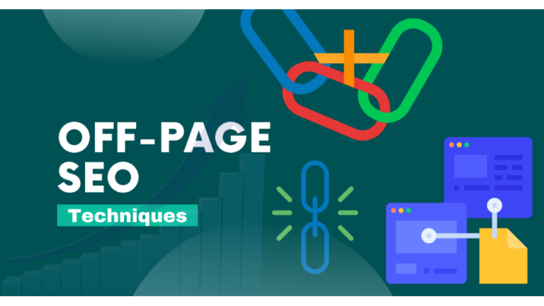
SEO Architecture: Build to Be Found
Technical SEO Is the Foundation, Content Is the Engine
A technically sound website won’t rank without good content. But great content on a technically broken site won’t rank either. Both have to work. In 2025, the technical baseline includes:
- HTTPS across all pages, with no mixed-content warnings
- A clean XML sitemap submitted to Google Search Console
- Proper canonical tags to prevent duplicate content issues
- Structured data (Schema markup) on key pages — especially service pages, FAQs, and articles
- A logical internal linking structure that distributes PageRank intentionally
- No orphaned pages — every page should be reachable within three clicks from the homepage
Schema markup deserves special attention as we move toward 2026. With AI-generated search results (Google’s AI Overviews, Bing Copilot) increasingly pulling structured data to populate answers, well-marked-up content has a meaningful visibility advantage over content that isn’t. This is an area where early movers will benefit disproportionately.
Content Architecture That Compounds
The brands winning organic search in 2025 aren’t publishing random blog posts. They’re building topical authority through systematic content architecture — pillar pages that cover broad topics comprehensively, supported by cluster content that goes deep on subtopics, all connected through deliberate internal links.
This approach does three things simultaneously: it signals expertise to Google, it keeps visitors engaged longer (reducing bounce and increasing time-on-site signals), and it creates natural conversion pathways — a reader who starts on a how-to blog post can organically find their way to a service page and a case study before they ever fill out a form. That’s your content system doing sales work your paid ads used to do. Claro.
User Experience Principles That Actually Move the Needle
Navigation Should Require Zero Thought
Your navigation is not the place to be clever. Users should know exactly where they are, where they can go, and how to get back — without thinking about it. Limit your top-level nav to five to seven items. Use descriptive labels, not brand-invented terminology. Make your primary CTA visible in the header on every page. If your site has more than 50 pages, implement site search and make it easy to find.
Trust Signals Belong Above the Fold
CMOs and founders often underestimate how much trust signals affect conversion rates at the top of the funnel. Logos of recognizable clients, specific quantified results (“Generated $2.3M in pipeline for a Series B SaaS company”), third-party review badges, and real photos of your team — these elements convert skeptical visitors into engaged prospects. Stock photos of people shaking hands in glass conference rooms do the opposite.
Forms Are a UX Problem, Not Just a Dev Problem
Every unnecessary field in a form is a conversion leak. For lead generation, ask for only what you need to have a meaningful first conversation — typically name, email, and one qualifying question. Multi-step forms often outperform long single-page forms because they reduce perceived friction. Test your forms on mobile. Most people filling out a contact form in 2025 are doing it on their phone, often with one thumb.
Looking Ahead: What Changes in 2026
The shift worth watching is the growing influence of AI-native search behavior. As more users start their research in ChatGPT, Perplexity, or Google’s AI Mode rather than a traditional search bar, the sites that get cited are the ones with clear authoritative content, strong structured data, and genuine EEAT signals — Experience, Expertise, Authoritativeness, and Trustworthiness. Publishing thin content at scale will increasingly backfire. Depth, specificity, and demonstrated real-world expertise will compound in value.
Zero-party data collection will also become more critical as third-party cookies continue their deprecation. Your website needs to be able to capture intent signals, segment visitors, and personalize experiences using data users willingly provide — through surveys, quizzes, preference centers, and content offers. Build those mechanisms now, before you need them.
The Bottom Line
Following website development best practices in 2025 means treating your site as a living system, not a finished product. It means technical performance, content architecture, user experience, and SEO working together toward a single outcome: turning organic traffic into pipeline, without paying for every click.
If your current website isn’t doing that — if it’s slow, disconnected from your content strategy, or built around what looked cool three years ago — the gap between you and competitors who’ve gotten this right will keep widening.
Ready to turn your website into a content-driven growth engine? Start with our guide to building a B2B Content Marketing System that replaces paid ads with organic blogs — it’s where strategy, site architecture, and sustainable growth actually connect.
Written by Jose Villalobos, Social Peak Media
“`